

Photoshop is a powerful tool for Photography and Graphic Design. It actually took me a long time to figure out how to get text to stand out – so in reading this you’re getting an extreme shortcut in your learning curve. Or how to do it the easy way 😉
In order to use Photoshop to make text stand out effectively YOU MUST understand how layers work. I wrote a post about how I Cartooned myself, which includes an explanation of layers. Would recommend looking at the layers part if you don’t know what layers are.
ADD Us On Social Media
(We syndicate out to some of these sites, so maybe be easier for you to follow us on these platforms :
Gravatar – FaceBook Profile – FaceBook Page – Shitter Profile – Blogspot – Pinterest – FineArtAmerica – YouTube – YouTubeTV –
There is actually ONLY ONE WAY to make text stand out on any photo or graphic design. So we’ll start with that and add to your toolbox until we’ve given you 4 ways. From this you can build combinations and easily master making text stand out using Photoshop.
DO have patience with Photoshop – it’s an incredibly powerful tool. The downside of having that much power is that it sometimes seems very complex. Persistence and patience will pay off I can promise you that.
These examples are designed to build your knowledge, so please start at the beginning and work your way through – there is an order of learning that will help you 😀 Or in other words skipping a step will slow down your learning, or you won’t learn anything.
Web designers need to know about these techniques, especially if you they’re doing their own graphic design. These techniques can be used to help enhance an “average” website into one that’s outstanding. So please PAY ATTENTION if you want to learn how to produce better websites, blogs or just about anything that has text on it …
Sponsor message – IF you’d like a web designer to help you with your project – please contact us DonCharisma.com we’re pleased to help on commercial projects of any size.
Without further ado – here’s my guide on how to make text stand out using only the power of Photoshop … please do feel free to follow the examples if you want to learn the techniques. It’s pretty simply bread and butter stuff to be honest 😀
1. Contrast
Virtually all methods of making text stand out using Photoshop (or any other Photo/Design software), are levering the same principle – contrast. We all understand contrast, whether knowingly or not. Without it we wouldn’t be able to read or write.

Black letters on a white page for instance …

OR the old school computer text on a display …
These are both examples of contrast being leveraged to make text stand out. The same principle applies in Photoshop. So how do we do it in Photoshop ?
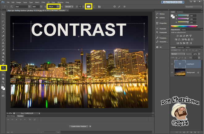
Well let’s take this stock photo as an example :

Very simply:
- Use the text tool on the tools panel (left hand side) to draw a text box.
- Type the text you want to make stand out
- Use the character bar (top) to change Font/Size/Colour – Mine is Arial Bold 250pt White. Please note for large text sizes you may need to type the size in the box !
Here’s what it looked like on my screen (highlight boxes for the tools mentioned) :
2. Stroke
Another very simple technique for making text stand out is to put a “stroke” around the text. There’s a special panel in Photoshop called the “Layer effects and styles” panel. Adobe have help on it here. Let’s call it “the effects panel” for short.
How I usually access this panel is to create the text box first, type my text and then double click just to the right of the layer name in the layers panel. Don’t worry if you didn’t get that I’ll highlight the exact place in my example.
Very simply :
1. As you did in the example above, create text box with text you want to highlight.
2. Double click just the right of the layer name to bring up the effects panel.
3. Click on the “Stroke” style and adjust the size to suit. In my example it’s a basic black stroke 10pt.
This is what it looks like without the stroke :
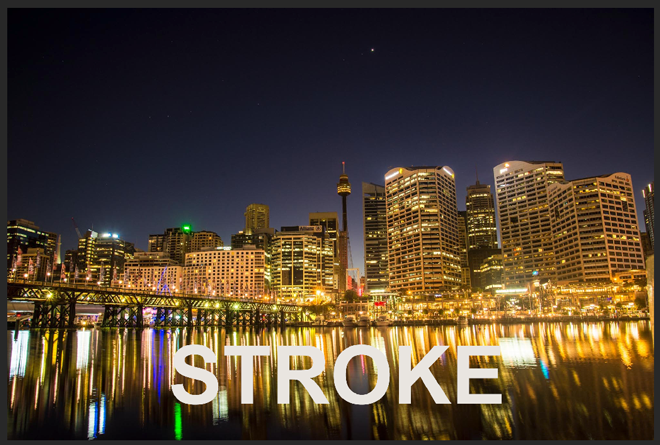
The problem that is without doing something with the text it tends to blend with what’s behind. So adding a stroke here, will make it stand out.
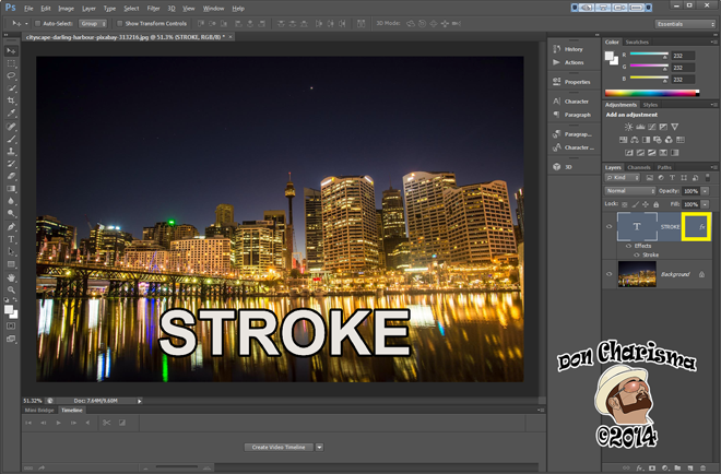
This is my Photoshop window – I’ve highlighted the place to double click for the effects panel (in dayglo yellow!). You won’t see the words “fx” until after you’ve added the stroke, by the way 😀
3. Overlay
This is a very commonly used technique to alter what’s behind the text in order to increase the contrast. Commonly used overlays are black and white (text in the opposing colour).
Very simply :
- Create text box with text the size and colour you desire. I will continue with white text to keep it simple.
- Use the rectangle tool to create a black rectangle that covers the text, and a bit more to provide a “border”. Try to keep things “symmetrical” – ie the same size gaps at the left, right and bottom. This helps to keep it pleasing to the eye, trust me on this …
- Drag and drop the rectangle’s layer, so that it appears behind the text. It should be between the text layer and the background layer.
- Adjust the “opacity” of the rectangle layer to around 50% ish.
Here’s what my Photoshop window looks like afterwards :
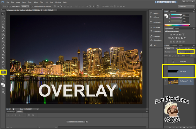
I’ve highlighted where the shape tool is (left hand side) for drawing the rectangle. Also the position of my rectangle layer between the text layer and the background layer (right hand side). And lastly the opacity box to change opacity to around 50%, in this case it’s 56%.
Tip – I also quite often put a black or white rectangle to cover the entire photo, either to increase or decrease contrast of the entire image – it’s a quick way to do it, gives a nice washed out effect or in the other direction can make it look later in the day than it actually is 😀
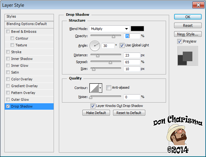
4. Drop Shadow
This is a neat effect, can lend a “3D” feel to the text popping up from the photo. Basically we’re putting what looks like a shadow behind the letters.
Very simply :
- Create a text box – to your desired size, colour and font as you’ve done in the other examples.
- Double click on the text layer to bring up the effects panel.
- Navigate to “Drop Shadow” and adjust the sliders for “Distance”, “Spread” and “Size”. Mine are 23, 65 and 10 respectively in this example. The rest of the settings are the defaults.
This is what my Photoshop window looks like :

And what I call “the effects panel”, and Adobe call “Layer Style” :
Summary And Closing Notes
Contrast is the main tool used to make text stand out on a photo or graphic design, using Photoshop (or any other graphics package).
I’ve explained the techniques of basic contrast, stroke, overlay and drop shadow. These techniques can be built upon (and combined) to form more sophisticated methods of making text stand out.
You should pay particular attention to what I call “the effects panel” – as this is where most of the clever stuff goes on with making text stand out (or look visually appealing for that matter). I do spend a lot of time here. It’s a seemingly small number of tools, which do actually do offer a bewildering array of options for pretty’fying text 😀
Experiment with the use of colour for text, strokes, overlays and drop shadows. High contrast are things like black/white and red/yellow, but there are obviously more subtle contrasts for subtler effects. Red/yellow is often used for instance in before and after photos.
Happy Photoshop’ing … as a bonus, if you want to share links here to your creations, then I’d love to see what you come up with !
Cheers
Don Charisma
Don Charisma’s Examples
Randomly’ish selected to show off what can be done 😀

Stroke and overlay.

Pure overlay.
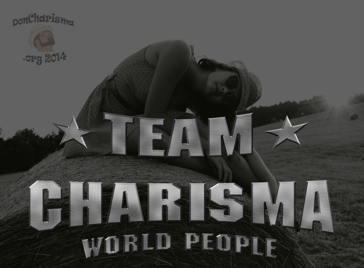
The entire photo has a black overlay to make the metallic writing stand out.

Stroke used on main text. Outer glow (similar to drop shadow) used for superman badge.

Stroke used on lettering with high contrast colours. Logo has an outer glow.

The entire image uses a white overlay. The text has a black stroke.
Same for the following six which were all created for our commercial site.


Here (from memory) I used embossing with a drop shadow.

Again embossing with a drop shadow that makes the text appear to be “floating above” the photo.
That’s all folks – have a dig around my blog for more examples 😀

Comments are invited
Comments are often welcomed, provided you can string a legible, relevant and polite sentence together. In other cases probably best shared with your therapist, or kept to yourself.

Very interesting and practical. A blog worth looking at again.
Thanks for dropping by. I’m a varied blog, so … “anything is possible with Charisma”
Bonjour mon Ami Amie

Je te souhaite une belle semaine et une belle journée pleine d’espoir ?
de joie , de bonheur
Ne te laisse pas aller au découragement, vu cette mauvaise actualité à la télévision journaux média
il y a toujours quelque chose de meilleur , une petite lumière qui brille au fond
de ton cœur, pour te réchauffer
Reste à l’écoute des petits bonheurs
qui te sont présent tous les jours autour de toi
Avec de la joie dans tes yeux , de l’amour dans le cœur
Ta vie te sera plus belle, pleine d’espoir
Merci de tes passages sur mon univers tout au long des saisons
Je laisse sur cette page un peu de moi , de ce petit écris
Qui me sorte du coeur
Bisous.
BERNARD
Really a great blog, Don. Thanks for your follow to mine. I hope you like my artistic writing work. Greetings from Villahermosa
My pleasure, thanks for stopping by 🙂
This is some wonderful, helpful information! Thank you Don 🙂
I needed that, Don! Now to actually do it (and, p.s, thanks for now following my blog!)
Can do this with gimp which I use in sizing, cleaning up hand drawn sketch and coloring my cartoons but this jump seems too much for this old man. I shouldn’t be afraid of learning new things but there comes a time when old people love the stability of the old ways in which we are comfortable. Getting out of bed in the morning is challenging enough.
Best of sticking with Gimp. This is an article I wrote a while ago. Might switch to Gimp soon any, Adobe have changed a lot, and Gimp is free.
LOVE Photoshop!!! – Really great post
Thanks for your ‘Follow’ on my Blog 😀 Appreciate your interest!
My pleasure, will try and stop by put some likes for you when I get time.
Some techniques I found useful in photoshop 🙂
Cheers
Don
I’ve actually been looking for a way to put my description on my pictures. I’ll need some practice but this looks like the best possibility I’ve seen. This is a keeper!
Thanks Bev … Some techniques I found useful 🙂
This was SUPER helpful. Thank you!
A good to keep post
Come back to it when you need it, it’s still be here 😀
It s always a lot of fun learning how to work snd transform photos on photoshop!
Thank you for sharing!
France
Absolutely … and you’re welcome 😀
Well said. After being in graphic arts for so many years I too have used similar techniques to make text stand out until know it is just second nature. Contrast, drop shadow, emboss, and stroke are some of my favorite tools. Also, highlight when i have a pretty busy background.
Thanks … and it’s actually simple stuff isn’t it ? … just amazes me how long it took me to learn … still c’est la vie, now I have a pretty good toolkit for text … I’m still struggling with Illustrator, like to do more with it because of the vector graphics being scalable to any size … I’ll keep at it, eventually I’ll crack it 😀
Really usefull tips! Thanks a lot for this post 🙂
Thanks, and YW 😀
Very helpful tips!
Thanks 😀
Oh how I wish I have the time now. I would love to learn this. Definitely I will refer to this article once I have extra time. Thanks Don Charisma!
😀 it’ll be here when you’re ready … you’re welcome !
I wouldnt suggest using a drop shadow for a website though. I dont know, seems like an old look to me. Stroke and overlay look much more clean, much more professional (and its what I use anyways-that and contrasting).
If one wants to follow current trends in flat design, then I’d agree. However this wasn’t a post specifically about web design. My overall idea was to convey (easy) techniques to increase text’s readability, fashion wasn’t part of the equation (well not that much!). Also my posts stick around on Google for months/years, and as fashion changes nearly as often as people change their underwear, for me it’s fair to include the technique. Today’s flat design is tomorrow’s 3d with drop shadows. Just as today’s single breasted suit is tomorrow’s double breasted suit.
Ha, you’re indeed correct. Although i don’t suppose this minimalist design era will phase out soon…it definitely will eventually.
You’re probably right on that too, flat design will have it’s day, until the next trend arrives … maybe it’ll be all drop shadows, or might be all outer glows … who knows !
I use photoshop a lot and have been experimenting with glows, drop shadows, bevels… you name it 😉 It’s all good fun though !! Thanks for the enlightening post 🙂
You’re welcome, and yes fun to experiment, each time I learn something new or add a new tool to the toolbox 😀
Reblogged this on richardbelding.
Thanks for the reblog 😀
Reblogged this on Benji Martin Photography.
Thanks for the reblog 😀
You’re welcome
You’re welcome.
Thanks for the tips. I have photoshop and play with it now and then, My daughter is really into it though and can do some really cool/scary stuff with photos & videos
I use it all the time for photo editing and graphic design … and yes scary things are very possible … I really want to get to grips with Illustrator, but seems a steeper learning curve than Photoshop, so I’ll keep chipping away at it 😀
Thankyou so much for the information 😀
You’re very welcome 😀