
Back in July, I wrote about my experiences Cartooning myself, because I wanted to show myself I could do it and I wanted to share with others my experiences.
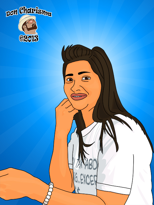
With a little free time on my hands I decided to take on a more complex project, cartooning my girlfriend. This is the end result of Another two days of cartoonification :

This time I had additional things to consider like hair, eyes, teeth, torso, also feminine features seem to be more complex than masculine, the devil really is in the detail !
FallenDesignsUK has done a very comprehensive youtube video on how to do cartoon portraits, so please do have a look at his video tutorials #1 and #2. Also have a look at some of the “speed art” videos he’s done for further ideas.
Pen Tool
The pen tool in Photoshop is the real workhorse of doing a cartoon portrait, so I’ve had to be accustomed to how it works, all the keyboard short-cuts, how to edit “paths” etc. Time well invested, as I’ve become more and more confident using it. Also watch how it’s done on youtube video.
“Path” tab next to layers
Clicking on the path tab next to layers, reveals that I can save paths to use again. This was very useful for redrawing lines and shapes that I later wanted to edit. In the end I had around 200 paths for this cartoon.
Shading
Shading is important, this time I used three tones, a highlight, a mid and a shaddow. Have a layer for each tone (and label it) and it’s worth playing around with the opacity of the layer to get the tones so that they are just right, most of mine ended up opacity in the 10-50% range. I found that I had to train my eye to see the tones and what kind of shapes they made, and also after some practice with the pen tool, the shapes start to get more “real” and easier to do – I start to feel like I’m getting good at it!. Also played around with picking a shaddow tone vs using multiply feature of the layer, seems it depends on circumstances, so just need to find what works.
Hair
Lady’s hair takes a bit of time to do. For my lady, I started with an outline (of the lines) and stylised the wispy strands, with kind of saw-tool patterns, which I thought worked well. Then to give an idea of how the hair flows I’ve added some extra lines, but not too many. I used the mid-tone to fill in the hair, then laid highlight on top. Then only a few shaddows again laid on top.
Eyes
The eyes were quite challenging to do, to make them look realistic. Worth watching the video in detail and following his method. The lightened bit around the pupil and then blurring helped to make them look more lifelike. The final touch of the “lens flare” with the two white dots really improved the overall effect.
Bracelet
My girlfriend was actually wearing two bracelets. I decided one of them was too complicated for the picture, so this has been removed. I traced over the outline of the “beads”, and then copied the colours from the original photo. I didn’t like some of the colours so used the “smudge” tool to gently push out the colours I didn’t want.
Mouth/Teeth
I started with straight vertical lines for the teeth. This didn’t look right, so I used combination of blur filter and smudge tool to make the black lines slightly wider at the top vs at the bottom. Also added in some grey areas on the teeth at the edges for shaddow. The tones on the lips were very important to get a more realistic look for lips.
T-Shirt
To start with I outlined the T-Shirt. Then added outline for sleeves and the the hem on the sleeves. Again I used three tones for the main body of the T-shirt, to account for the creases and give impression of depth. The writing I traced with the pen tool and then filled with a colour that I’d picked using pipette. The writing again gives impression of three dimensions.
Background
For the background, I got a vector background from all free downloads. I’ve resized it and positioned the centre of the “sunlight” somewhere near the middle of the face, which gives a halo like quality and emphasizes the main subject.
Perspective
Perspective is something that has to be kept in mind. For instance the left arm and hand are larger than the right. Same with the eyes, and the way the eyebrows sit on the face. Basically, because the picture isn’t a “face straight on”, her left hand features will always be slightly larger than her right hand features.
Conclusions
I’m short on time to today, so not as detailed as I’d have liked. Having said this I already did a detailed cartoonification post, so a lot of the detail there, I don’t want to repeat.
I wanted to show myself and show others that making a cartoon portrait is possible and not that difficult, just involves putting in the time and effort (and not giving up when it gets frustrating !). My girlfriend was happy with the result, as am I.
What’s next
I would like to do my cartoons in Illustrator rather than Photoshop, because one ends up with a vector drawing. A vector drawing is better because it’s scalable to any size. I have tried with Illustrator before but the software always seems to defeat me, so a challenge!

I just started following your blog. Am going to sit and read and relish every post this weekend. Be ready for an avalanche of comments.
Thank you for following my blog, a pleasure to have you. Hope you will find interesting articles here, I do my best to produce the best that I cna:)
Looking forward to hearing your comments…
Sincerely
Don Charisma
Interesting… love the PSP…
Thanks 🙂
I love Photoshops tips and tricks! Great post! and thanks for the follow, glad you liked my blog, I have returned the flavor!
THanks very much and my pleasure … Always happy to make a new blog friend 🙂
Cartoonizing my hair was the toughest thing to do! Great job btw!
Same for me, women’s hair is time consuming !
Cool — I’ll have to check this out — and it’s cheaper than Botox I’ll bet 🙂