
I’ve been working on my revamped commercial website DonCharisma.com. We needed some icons for the animated “buttons” on the homepage:
One for the building websites page, one for the SEO page and one for “contact us” page.
So I came up with these :
![]()
The forth one is in case we want to change the layout of pages and add a link to our about page.
I don’t like to pay for things unless I have to. Serendipitously the documentation for my new theme made me aware of two free icon sets – Genericons (by Automattic the WordPress people) and another set called Entypo.
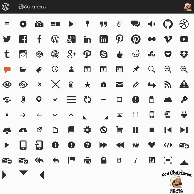
Here’s the Genericon icons :
And here’s the Entypo :

I decided to use the Entypo library as there are more icons (250). It was basically a copy and paste job in Illustrator from the supplied .EPS file. For the SEO graphic, I combined two icons from Entypo plus a “g” logo from elsewhere. For the “contact us” graphic I used what looks like a smartphone, plus a telephone and a mail icon. The “build page” was what looks like a webpage on a tablet computer.
This could have been done in Photoshop, but Illustrator is a slightly better choice for working with vector graphics as the file sizes are smaller and they can be scaled to any size. It’s largely a perfectionist issue, so either or really.
I’ve added Entypo creator Daniel Bruce on Twitter, and sent him a tweet saying “thanks and Entypo is awesome”. He didn’t reply, but he has favourited my tweet, so I reckon he got the message 🙂
Both Genericons and Entypo are highly recommended for download and use for this type of work. The downloads include a font that can be installed on your PC, thus enabling use of either set of icons in for example Microsoft Word or Adobe Photoshop.
Genericons are included (I think) in WordPress.com blogs, have a look at these, they are actually in the html code of this post :
Summary
I created icon graphics for my new commercial website DonCharisma.com very easily using free icon libraries (Genericons and Entypo) and Adobe Illustrator.

Impressive designs. Thanks for sharing info and how to.
You are very welcome 🙂
Well done Don. I particularly like the Contact and SEO icon.
Thanks hun, those had a bit more thought and are combined icons. I’ve since changed the about icon, and I’ve done around 10 in total for all the other pages on the site. The site is starting to really take shape now, looks great, will need some more writing but I’d say it’ probably 70% finished … cheers DOn charisma
Cool! Thank you for the info, love the buttons x
Thanks Elaine, you’re welcome of course 😉
Great design Don, I prefer the Entypo, they look better in one or another way.
I think I need to learn something about programming, so I can do some more fun. Do have an old Illustrator too.
Yes was same conclusion I came to Entypo, plus it’s more icons … not too much to do with programming really, more a lot of copying and pasting and resizing and changing colours, all can be done in illustrator if you have the patience and google the bits you don’t know … I found the image tracing facility in illustrator today, it’s really magic for this kind of thing and I hope to be able to use it for my cartooning when i get a chance 🙂
I’m looking forward to see your cartooning 😀
LOL, when i get some time I guess !
Love the modern, flat design. Looks like Metro Design Language.
Thanks Ryan 🙂 Don Charisma
Fabulous! Looks clean and fresh and smart – AND professional 😀
Thanks hun I do my best to be a pro 😀
I know 😉 You do well hey~
🙂