
I’ve been posting some photos from Australia (and other places) as and when my friend Chris Herron sends them over. I had been adding my own logo, and decided that it would warrant doing a logo for him also. Chris didn’t ask me to do the logo and I had very little to work on apart from what I know of him and the fact his surname is “Herron” …
So I decided to do a logo with a Heron bird and his name on it.
I thought you might like to share my insights. I’ve tried to keep it as simple as possible, but without leaving any of the important bits out. That way almost anyone could make the logo. What personally interests me is creative process that goes into it rather than the detailed technical challenges.
For the logo I searched for a vector file of a Heron. There’s a site called all-free-downloads which is great for looking for vectors, and there are some others – a good chance to exercise your Google muscles. If you can’t find a vector, then a large pixel size picture of what you want picture wise to put on your logo. Best obviously would be to draw one yourself in vector art software such Adobe Illustrator. Not all of us have the time or the creativity needed to do that!
I’ve included a large .PNG file at the end of the post for anyone who’d like to try this tutorial for themselves.
The “Creative” Process
I’ve already described my basic thought process – I think of the obvious, Chris Herron, Heron bird. The research phase is important, looking around at designs and getting ideas. Some might be able to start with blank canvass, then produce a masterpiece, for most, it’s looking on google images, books, magazines or perhaps even visit museum, art gallery etc.
It’s what I call the “creative chef”, I look at the ingredients, get a feel for them and look at how I can “cook” them together to make something delicious. For text on a logo or any kind of text of a picture, part of the art is lining things up. Horizontally and vertically, and sometimes even lining up with angled lines. I find that this sizing and lining things up makes the finished creation more aesthetically pleasing, and is therefore very worthwhile to spend time on it.
My “Masterpiece” Heron Logo
Do a “File->New” in Photoshop:

I’d recommend generally working with 8-bit/300dpi “blank canvass” in Photoshop, especially for a logo, as the colours are generally limited anyway. For the Heron logo, we’ll use a pixel size of 3000 x 2000 (width x height). As I intend the logo solely for viewing on screen, select colour profile “Don’t colour Manage this Document”. Oh and don’t forget to select Transparent background.

This should give you a “checker-board” of the blank canvas.
Next I drag and drop into Photoshop the Heron bird, resize so that it will fit. Then drag and drop over to the right hand side. Don’t worry about placing/sizing things exactly to start with, just get the Heron Bird, and the text into Photoshop. There a little tick on the top bar, press it when the Heron picture is approximately in place.
Now use the text tool to create a text box for “Chris”. Font I used is Verdana, Regular, 150pt. Now select the text.


Now you need to press on the color-picker that I’ve highlighted above, this will bring up the swatches dialog, but will also give you the pipette/eye-dropper. Use the eye-dropper to pick up the colour from the Heron bird, so the text is the same color as the bird. Click the tick to say yes text OK. You should now have a “Chris” the same color as the Heron bird.
Now do the same for “Herron”, draw a text box and type it in, the settings for text will be the same as before.

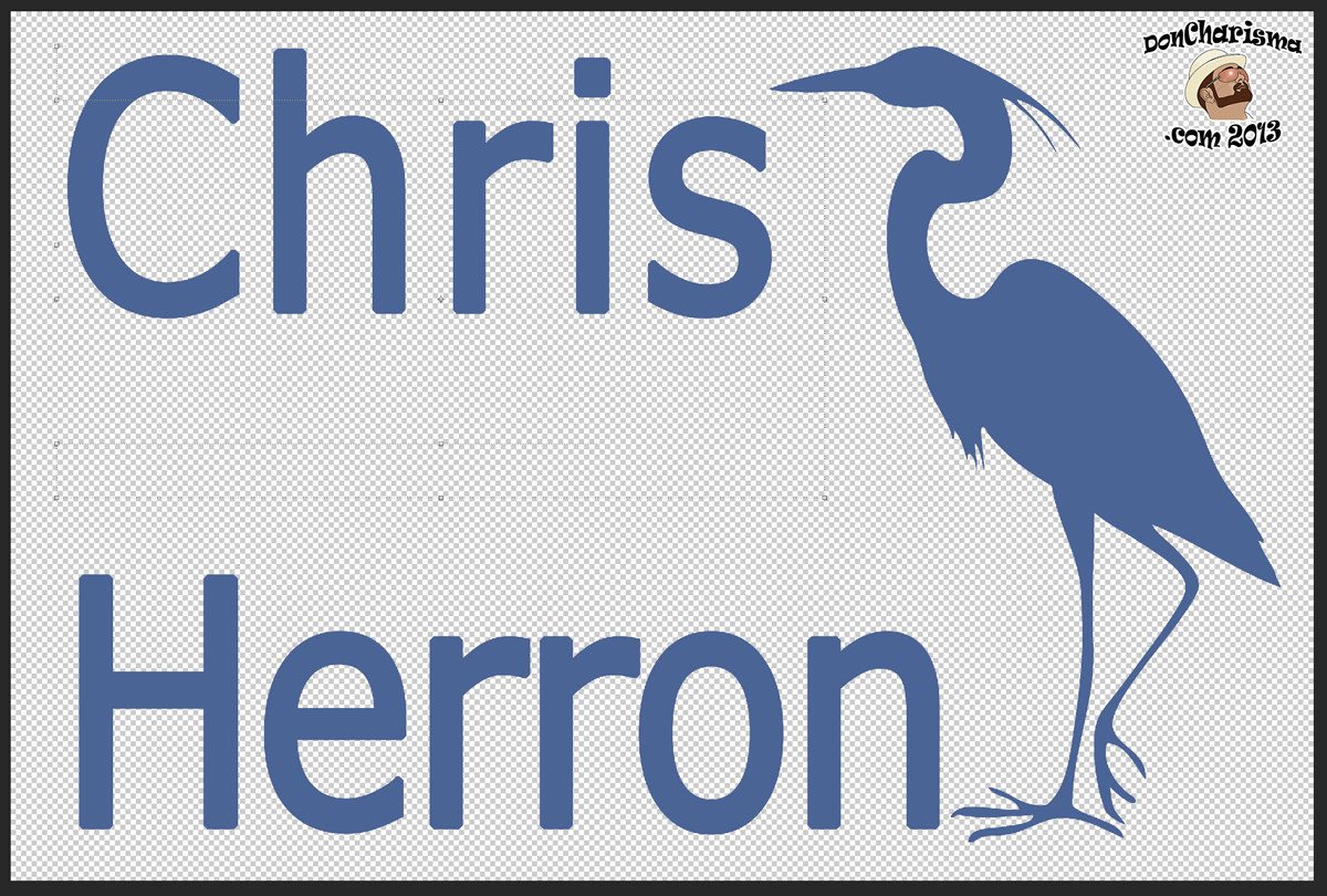
Now select the move tool, and I want you to move the both text boxes and the Heron graphic slightly towards the center of the logo, so there is a gap all around the edge (you’ll need this later).

As you can see I now have overlapping text and graphic, which doesn’t look good.
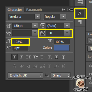
We could make font size smaller or use a different font, but I’m going to use the character tool to change the how the text is sized and spaced. For the “Herron” I have “condensed” the text by -50, so that it fits nicely and I’ve also increased the “height” of the characters to 125%. Basically for a better fit.
For the “Chris”, I’ve just increase the “height” of the characters to 125%.
Now we’re close to finished logo.
Another technique I use to line things up is the to use a “guide”. Select View->New Guide, and select a vertical guide at 0cm. Then using the move tool, move the guide so that it’s where you’d like the “C” from Chris and the “H” from Herron to be. Now move the Chris text box and the Herron text box so the “C” and “H” line up.
Tip: a quick way to select a layer (ie “Chris”, “Herron” or the Heron Bird), do a right click on the layer you want to select, with the Move Tool selecte. You should get a little menu that has name of the layer you want to edit, select it.
You can also put in more vertical and horizontal guides, this helps to get things lined up. I quite like the dot of the “i” in “Chris” to line up with the Heron’s beak. Spend some time looking at the characters, the Heron and start to line things up. You can move things slightly, or you can resize things slightly. After a while you start to get a “feel” for it.
Tip: when resizing hold down the shift key and resize from any corner. This will preserve the “aspect-ratio” of the object your resizing. In laymans terms, aspect ratio is the object’s relative dimensions (width vs height), which will remain the same by holding down shift key.

The Heron bird’s feet are lined up with the bottom of the word “Herron”. Keep on lining things up letters against letters, making minor adjustments, resize the graphic, until your happy. Often I’ll take frequent breaks, make a cup of coffee/tea etc, come back and I’ll see another slight adjustment.
Tip: Photoshop doesn’t always display exactly what the finished image will look like on screen. When I want to check how it really looks or think I’m nearly finished, do a File->Save As, change file type to JPG and save it (eg “temp.jpg”). Then locate and open the file you’ve saved in Windows image viewer, and check it. Like a kind of proofing process I guess. You’ll usually find it looks better than it does in Photoshop.

Before progressing onto the next step (adding a stroke), save your Photoshop project .PSD file, and then save it again as “Heron Logo2”. This way you have the original, and a backup that you’re working with. This is in case you want to go back and make changes to the text, font etc.
We need to merge the layers, before we can do this we need to “rasterize” them. Rasterizing means converting into pixels, which text/vector graphic isn’t until you you rasterize it. And no it has nothing to do with Jamaican gentlemen:)
To do this you need to go to your layers, and select them all, do this by clicking on the layers (one by one) whilst holding the control key. Then right click, select “Rasterize Layers”, then right click again “Merge layers”
Now right click again on the new single (merged) layer, and select blending options. Check and select “Stroke”, change stoke size to 30px and change colour to white.
The reason we do this “stroke” around the logo, is so that it doesn’t blend into the background when we add it to a photograph. That’s it.
You could save and use direct from a .PSD file.
Or if you prefer to save to a .PNG file, use File->Save For Web, select PNG 24 bit and then you have a .PNG file to use as well (you could reduce the pixel size here to suit your purposes). Don’t forget to check “Transparency”. Also uncheck “Convert to sRGB” and in preview use “Monitor Color” It needs to be .PNG or .PSD so that we preserve the transparency (the see-through background)
.JPG doesn’t do transparent background so don’t save it as a .JPG
To use the logo back in Photoshop, load a photograph that you want to apply the logo. Drag & drog the logo (.PSD or .PNG), resize and position to suit. Then I reduce the opacity of the logo by eye, which is usually around 50%, so that it blends in better rather than becoming the subject of the photograph.
Conclusion
Here’s the finished logo, and the original one that I did in Illustrator for Chris. I didn’t turn down the opacity which I’d recommend doing “in real life” for adding the logo to a photo.
Although there’s quite a lot of steps, it’s actually relatively straightforward to produce a logo in Photoshop. Obviously you could use a different animal or picture in your logo. You could also use a different font.
Hopefully this how-to could form the basis of you being able to create your own logo, with you own picture.
Advanced
If you’re a perfectionist like me then you might want to use a Vector art package such as Adobe Illustrator or the FREE Inkscape to create your logo. From that you can create a .EPS file or a .AI file that can be dragged and dropped straight into Photoshop (or GIMP). The rationale for creating a vector is that it is scalable to any size. So if for some reason your work will end up on a 50 foot billboard, then you will already have a logo to go on it:)
Resources & Sources
Unless otherwise indicated, all original photographs sourced from THE PUBLIC DOMAIN such as Google Images.
If you want to reuse anything here, please could you reference back to this post with a link, and credit to the author.
Lastly here is a 1200×2000 .PNG file (transparent background) you can use if you want to try this tutorial:


Neat. Can you make me an angel? At one time I knew how to do things like that, but most of my brain cells are gone now. Of course I’m still an angel though. A slightly deranged one, but still…
How’s this :

COOL!!
Thanks:);)
I love photoshop. I’ve created a ‘signature’ in PS and then saved it as a brush so I can just click it on to the bottom of photos. That works as well. 🙂
That’s a good idea, I haven’t done much with Brushes as yet, Photoshop takes a long time to learn !
I’m gonna have a play with GIMP at some point have heard some good reports and it’s free:)
Cheers
DC